In the first two weeks of February, users will see a visual update of the LHV mobile app. Although the new look is the first thing that catches the eye, the update also brings many changes to the app’s information architecture and user-friendliness. This will allow us to create a strong foundation for this year and future updates to the app.
“Changes are part of the development of every company. With these changes, we want to set new standards ourselves, rather than follow existing trends,” said Annika Goroško, Head of Retail Banking at LHV, explaining the background of the process.
The current changes are the first steps in a major update of the app throughout 2026. “We are talking about a well-thought-out visual update, with the first substantive improvements made to it. Major functional improvements and new features will be available to clients in the coming quarters,” explains Annika Goroško, Head of Retail Banking at LHV.
Many familiar features will also remain for the users of the app. For example, switching between accounts, payment workflows, the ‘Request money’ function and everyday banking views, in particular, will undergo a visual update.
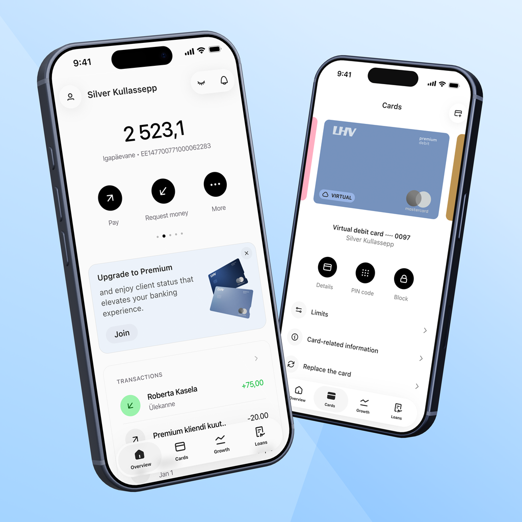
What exactly got a new look?
1. Navigation, or the horizontal main menu of the app (tab-bar)
- We have divided all the content and functionality between four large themes in the menu:
- Overview
- Cards
- Growth
- Loans
- Products and services previously included in the menu item ‘Menu’ are now featured in the opening views of the topics. Everything related to settings has been moved to the ‘Settings’ menu item.
- The new menu is simpler and clearer. This is more in line with how users conduct their banking operations.
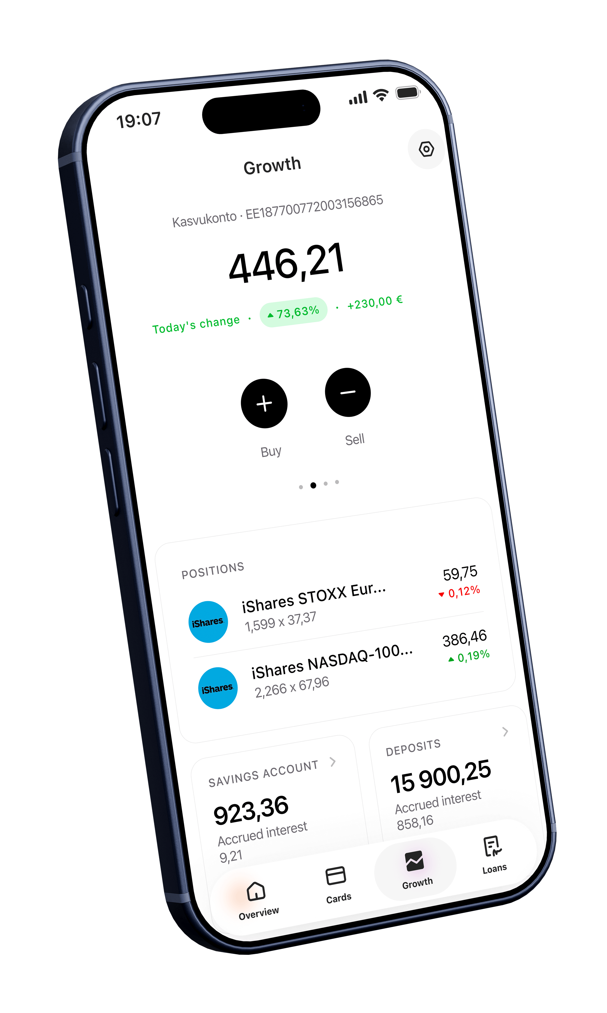
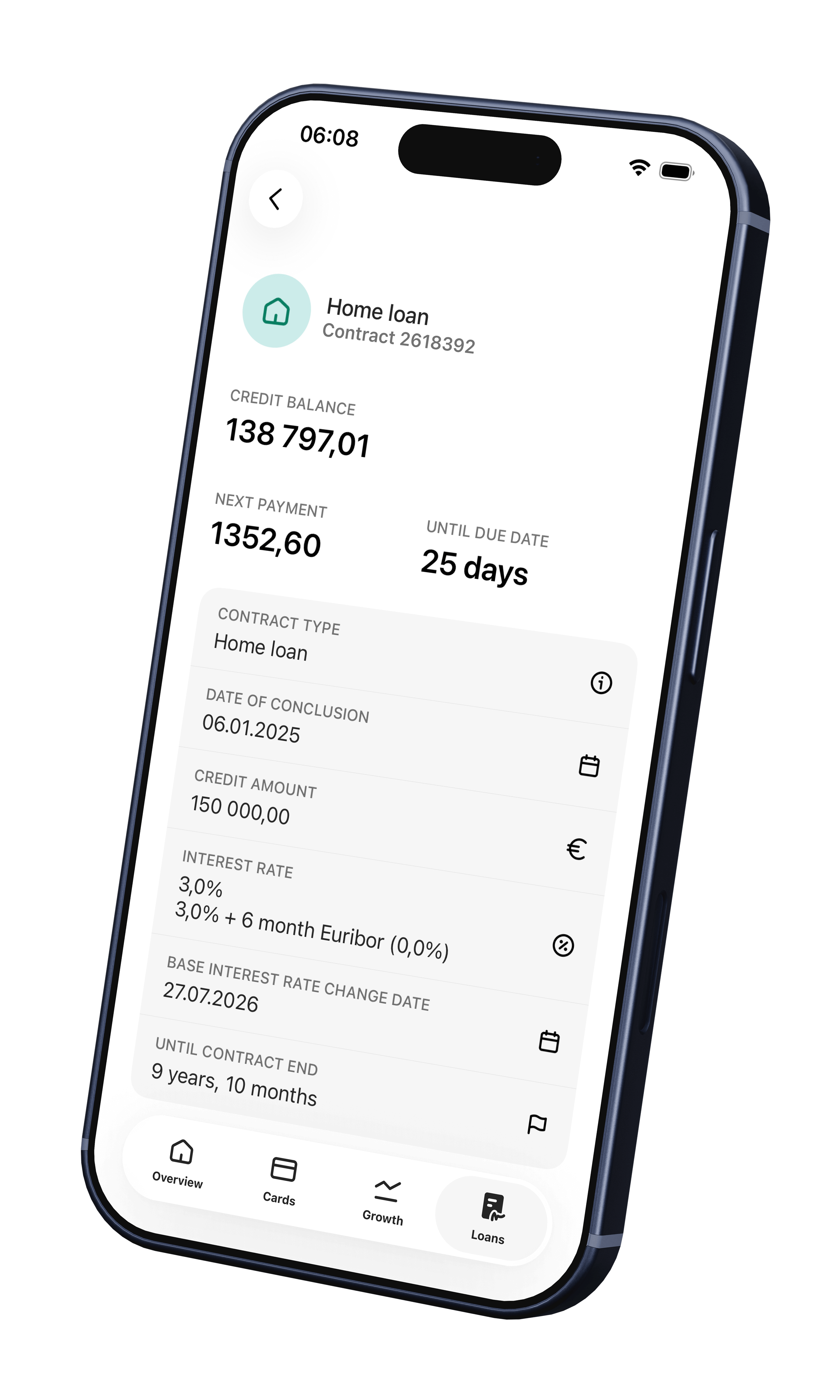
2. Main views and information architecture
- Main views ‘Overview’, ‘Cards’, ‘Growth’, and ‘Loans’ get a new structure and a modern look.
- Main account-related activities (e.g., the ‘Pay’ button) are now located next to the account balance and details. This brings features such as limit views, settings, and currency exchange closer to the user.
- The opening views are longer. This means that by scrolling down the page, the user gets more information and a clearer view than can fit in the first screen view.
- We now present the information in more logical blocks and sequences that better support the use and purpose of the products.
- We have added widgets to the opening views for displaying familiar balances, accounts, positions, and transactions. These display product information or direct the user to order them.
- What remains is the habitual ‘swiping’ of accounts and remembering the recently used accounts.
- The main views of both ‘Overview’ and ‘Growth’ have been supplemented with ‘Total free balance’ and ‘Total market value’ views for users who prefer to have a clear overview of their assets.
- Asset management is more meaningful and playful than before. We have brought the deposit, pension and functional gadgets closer to the user (‘Watchlist’, ‘More popular purchases’).
3. Location of role selection and function
- Whether the user is currently in the role of a private individual, a company, or their child, can now be changed in the app header on the left by clicking on the username and/or avatar.
- The user selects the role and changes it in a separate view. There are also shortcuts to contacts and to both user and app settings.
- A new feature is the ability to use the search function to select roles. This is particularly convenient for users who have more than four accounts.
- Users can also see a link to their current preferences and offers in this view, and soon, also to the loyalty programme.
In addition, lots of new and existing useful features
- We made the function for hiding/blurring amounts, transactions, and positions more visible and easier to access. The user can also control the display of this function in ‘Settings’.
- The order in which accounts are displayed can still be changed in ‘Account settings’.
- In the Growth view, the user can specify which accounts to use in the ‘Total’ calculation and whether, for example, the money in the account should be shown in the portfolio.
- The user can choose whether to display the main menu with the names.
- And a lot more
To use the new LHV mobile app, download the latest version from the App Store or Google Play starting from 4 February.
For urgent matters, please contact our customer support.
If you would like to provide feedback on the updated mobile app, you can do so via the form on our website.
What’s next?
Over the course of the year, we will continue to gradually improve all views and functions in the LHV mobile app.
Along with this, there will also be many changes to our internet bank, where we will start using the same design language and system. A good and consistent user experience across channels is something we pay a lot of attention to.
Our primary focus is on the area of wealth management. For example, we are developing the experience of buying and selling investment instruments, pension views, and watch lists.
We are also improving financing request workflows and the insurance claims handling process.
There is a strong emphasis on the applicability of different views in the app. We create opportunities for users to configure their views and content components to meet expectations for more personalised content, better analytics, and more convenient financial literacy and planning tools.
“We are developing all of these features together with our clients. We actively seek and listen to feedback, analyse data, and look for solutions to make the end result as user-friendly and valuable as possible,” explains Annika Goroško, Head of Retail Banking at LHV.
 Katrin's journey from Mustamäe to Paris: finding the courage to challenge herself2. july 2026Business/Economy/Banking/Financial wisdom/Insurance
 Five questions to ask yourself before taking out your first home loan25. june 2026Youth Bank/Banking/Financial wisdom/Economy
 They asked, we delivered. LHV's customers can use the Smart-ID+ solution11. june 2026Banking/Business/Economy/Financial wisdom