AÅÄBCDEFGHIKLMNOÖPQRSTUVWXYZ
aåäbedefghijklmnoöpqrstuvwxyz
#€%&/()=?©@,.ÆæØø
Logo
Our logo reflects our calm approach and resolve. It also hints at forward motion, while being unique, bold, simple and impactful.


Whenever using the logo, it needs to be given room to breathe. Do not crowd it with other elements, or position it too close to borders. The white space required is a minimum of one part of the logo’s height all around.
There are no size restrictions on the logo itself, as it has been designed to be legible at all sizes.

Typography
Typography plays an important role in our identity. We use Helvetica Neue, with its simple geometric shapes ensuring legibility while offering a clean, timeless appearance. It’s a versatile choice across various designs in both print and digital.
We use different font weights depending on the point size. Always ensure the font is legible when deciding on the weight to go with.
Helvetica Ultra Light
Helvetica Neue Thin
AÅÄBCDEFGHIKLMNOÖPQRSTUVWXYZ
aåäbedefghijklmnoöpqrstuvwxyz
#€%&/()=?©@,.ÆæØø
Helvetica Neue Light
AÅÄBCDEFGHIKLMNOÖPQRSTUVWXYZ
aåäbedefghijklmnoöpqrstuvwxyz
#€%&/()=?©@,.ÆæØø
Helvetica Neue Regular
AÅÄBCDEFGHIKLMNOÖPQRSTUVWXYZ
aåäbedefghijklmnoöpqrstuvwxyz
#€%&/()=?©@,.ÆæØø
Helvetica Neue Bold
AÅÄBCDEFGHIKLMNOÖPQRSTUVWXYZ
aåäbedefghijklmnoöpqrstuvwxyz
#€%&/()=?©@,.ÆæØø
Key words are highlighted by using heavier styles like Helvetica Neue Bold. At least half of the text must always be in Helvetica Neue Thin. If necessary, legibility can be aided by only using bold, such as in outdoor ads.
Text is generally to be aligned left
Kerning: optical
Tracking: Bold at least -30
Leading: 80-100%
Disclaimer: Regular
Free transfers
since 2009. No need to sign up for a plan.
Financial service provider AS LHV Pank. Read the terms and conditions and consult experts.
Euro payments are free of charge within the bank, to other Estonian banks, as instant payments, and as SEPA payments.
If Helvetica Neue is not available (such as on certain social media platforms), Arial may be used as an alternative.
Arial Regular
AÅÄBCDEFGHIKLMNOÖPQRSTUVWXYZ
aåäbedefghijklmnoöpqrstuvwxyz
#€%&/()=?©@,.ÆæØø
Arial Bold
AÅÄBCDEFGHIKLMNOÖPQRSTUVWXYZ
aåäbedefghijklmnoöpqrstuvwxyz
#€%&/()=?©@,.ÆæØø
Colours
Our primary colours – black, grey and white – all convey a professional, timeless appearance. They also give our visuals clarity and legibility, making our brand accessible to all.


Additional colours
Away from our primary colours, our palette of additional colours helps keep the design of our website and user interface consistent, while distinguishing us from the competition. They make our visual elements fresh and emotive, complementing our primary colours and elevating our brand.

“The teeth”
Our teeth are one of our main visual elements.
They’re made up of vertical gradient surfaces, and can consist of different colours from our palette. Additional effects such as multiply and hard light may be used to further emphasise their impact, while the teeth can play with the logo as part of an illustration.

Illustrations
Illustrations are one of our most important, and unique, means of expression. They fall into four different categories:
People: Used for bringing scenes to life, showing activities and creating emotion.
People can bring often dry financial information to life in more emotive, relatable ways. They reflect openness, accessibility and a caring attitude, three values that we think are vital in today’s banking world.

Objects: These show the situations and environments our work comes to life in.
Objects can make complex information more understandable, helping us build trust with our clients by being clear and transparent from the start of our relationship.

Abstract shapes: To add more visual dynamics to our creative output.
These shapes don’t show specific objects. Instead, they support our messaging in a more nuanced way, adding extra layers to our creative that captivate our clients’ attention.

Symbols: For reinforcing our message and displaying information in a simple, clear way.
Symbols are especially important where we can’t display a specific product, such as loans. In these cases, the product name should be shown in text, with a symbol creating a visual association and reinforcing familiarity across different situations.

Our photographic style
Whenever we use photography, we should hark back to our beginnings, evoking the crisp, clean light of Nordic summers.
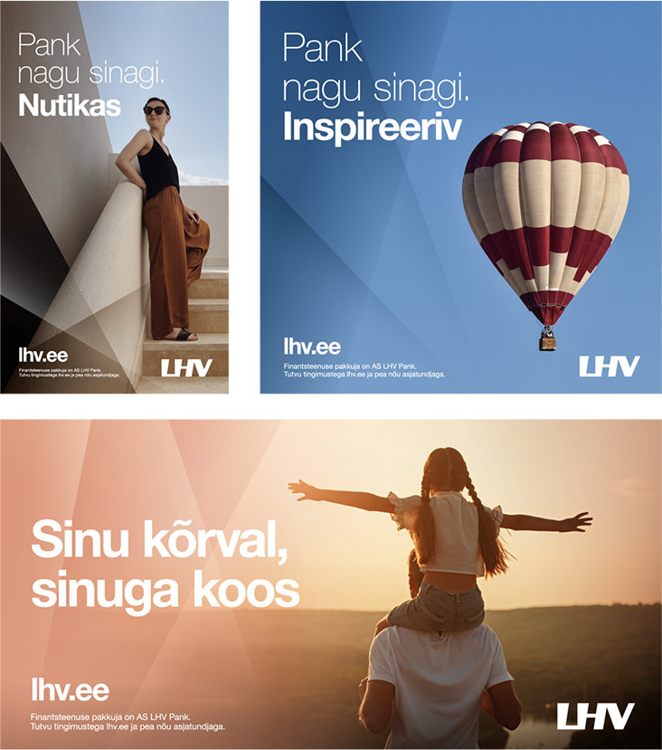
This means using a modern, professional style, capturing moments that bring nature and humanity into every image. We never use staged photography, always preferring dynamic, active moments of real life to better reflect the people and businesses who bank with us.

Using the teeth with photography
When our teeth mix with our photography, they create strong, instantly recognisable visuals that stand out in a competitive market. Not only do they elevate the photography, but they also bring our own distinct style to the image, turning a nice shot into one that could only belong to LHV.
Use caution, however. The teeth are there to support the image, not dominate it. Ensure they remain neutral and tasteful, with balance being the key.

Pictograms
Pictograms help make our messaging easier to understand, clarifying important elements so that people can grasp them immediately.
They can also be used to illustrate smaller passages of text, supporting their content so that readers can understand points at a glance. Colours from our additional palette should be used here, helping the pictogram stand out against our primary background colours.
Neutral grey
Neutral grey pictograms provide clarity without adding an extra emotional tone. These are ideal for situations that need to be kept calm and balanced.
Pink
Pink pictograms add friendliness and warmth to an image. They work best with topics that are human-centric or emotionally evocative.
Blue
Blue pictograms help convey messages of trust and calm. Use these with fact-based or strategic content to emphasise our clarity and professional qualities.
Design examples
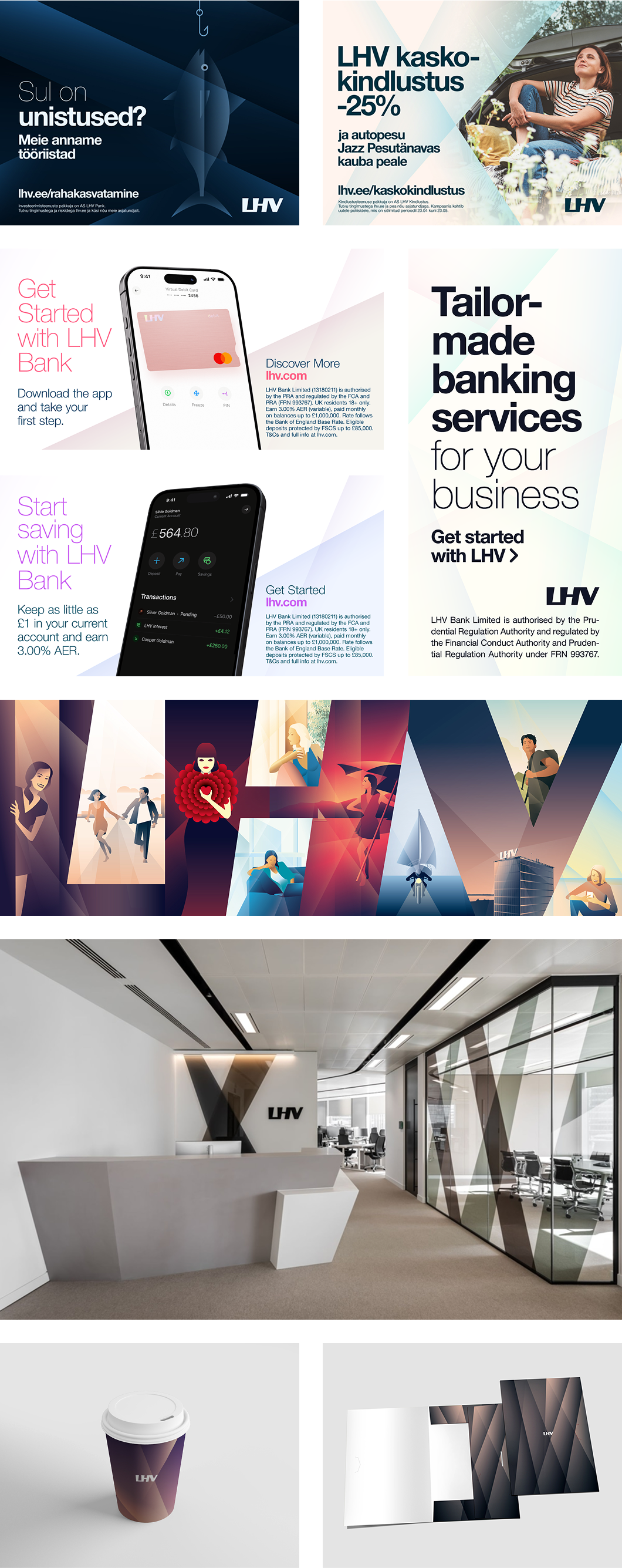
Now you’ve read all about it, the best way to understand our approach to design is to see it in action.
These examples will show you how all our brand elements come together in various environments, while staying stylistically consistent and unique to our brand.


